


At the very beginning of 2024, we have already identified several trends in graphic design colors that are sure to catch your eye, captivate you, and ignite the spark of creativity in your heart. Isn’t this precisely the role of graphic design? In an era characterized by rapid technological advancement, colors in graphic design transcend mere aesthetics to embody our collective experiences, values, and aspirations. This year, the emerging color trends stand as a vivid testament to our resilience, creativity, and unwavering optimism.
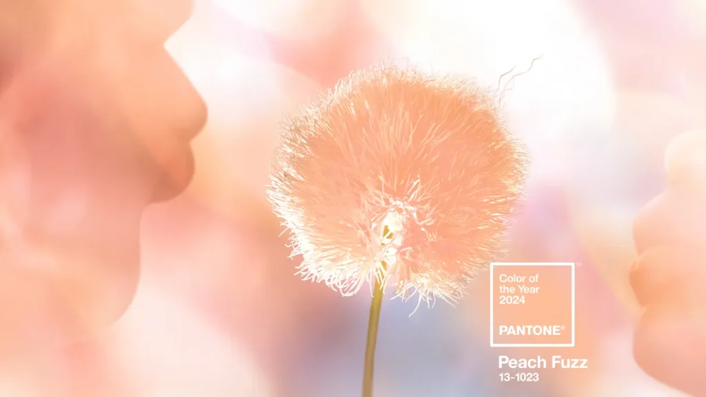
What is PANTONE 13-1023 Peach Fuzz?
PANTONE 13-1023 Peach Fuzz embodies a yearning for self-care and compassion towards others. This soft, velvety peach shade exudes a welcoming warmth that enriches the mind, body, and soul with its inclusive aura.
Now that you’ve discovered Pantone’s color for 2024, we will continue with our specially curated list of color trends in graphic design for 2024. Exploring the depths of this year’s color palette, we uncover a spectrum that resonates with our current global narrative. These are not just colors; they are stories waiting to be told, emotions ready to be felt, and ideas eager to be shared.
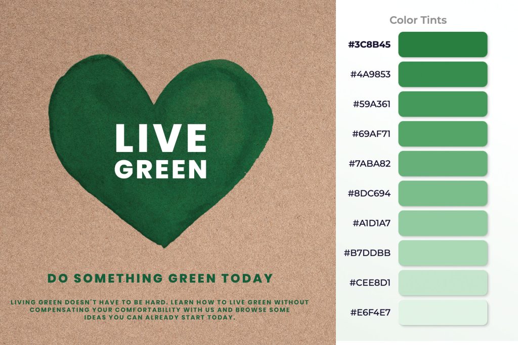
Sustainable Greens
In a year where sustainability is not just preferred but demanded, shades of green take on new significance. From soft sage to vibrant emerald, these hues speak to our growing commitment to environmental stewardship. They embody the spirit of renewal and balance, reminding us of nature’s resilience and our role in its preservation. For us, this trend is gaining increasing popularity in graphic design, as more companies, like IKEA, pivot towards eco-friendly products and a sustainable lifestyle. Furthermore, green always evokes feelings of cleanliness, health, vitality, hope, and prosperity. This is why companies across a wide range of sectors might opt for this sought-after color.why companies from many different sectors might choose this desirable color.
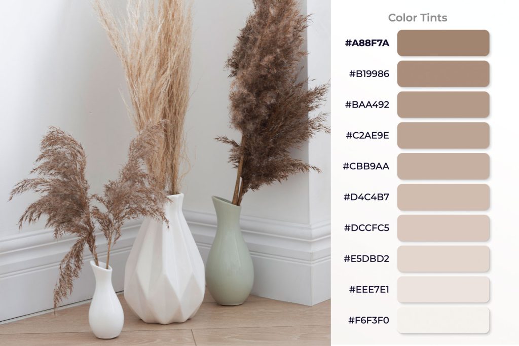
Warm Neutrals and Earth Tones
Just one word. Luxury. The trend towards simplicity shows in the love for warm neutrals and earth tones. From light sandy beiges to deep terracottas, these colors bring a sense of calm and steadiness. Neutral colors draw their inspiration from the natural hues found in the environment. Consequently, they are some of the earliest colors utilized by humans. Many graphic designers prefer working with vibrant colors, which can make the decision to use neutral tones a bit challenging. However, this effort is well worth it, as it results in a sophisticated vision of luxury for the client that isn’t overpowering. So, if you’re seeking a more elegant appearance, don’t hesitate to choose this color palette.
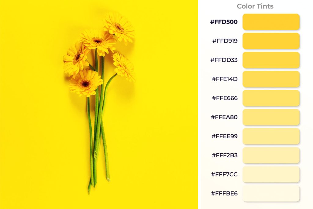
Bright and Optimistic Yellows
Yellows, from mellow pastels to vivid mustards, capture the collective yearning for sunshine and optimism. These are the colors of joy, hope, energy, and forward motion. They stand out in any design, bringing warmth and light, and encouraging us to look ahead with positivity. We definitely cannot deny that a banner on social media with a bright yellow background is likely to first catch our eye and second, infuse us with positive energy (assuming, of course, that the design is well-executed). And what’s better than that? Customers will imprint the things that energized them positively in their minds and will subsequently always associate the company with positive emotions.
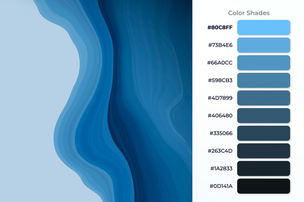
Tranquil Blues
It certainly won’t surprise you, but some things don’t change with time, do they? In 2024, this color continues to be preferred by many companies aiming to inspire trust in their customers. The spectrum of blues, from airy pastels to deep navies, offers a counterpoint to the year’s more vibrant hues. Blues are synonymous with tranquility, authority, trust, and dependability. They provide a visual haven, a moment of peace in a fast-paced world, making them essential in any palette aiming for balance and calm. There’s no two ways about it. It’s evident why many tech companies specifically opt for blue as the cornerstone of their brand identity.
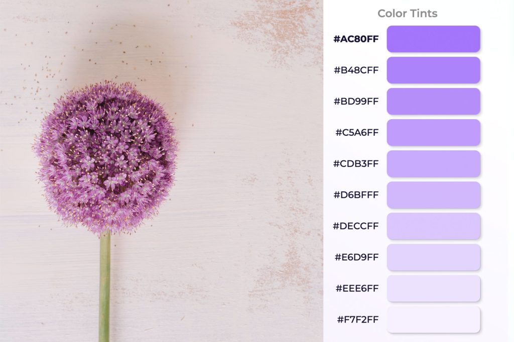
Dusty Lavender
This is one of our favorite color palettes. As we further embrace the digital realm, lavenders and purples emerge as colors that bridge the gap between the virtual and the physical. Lavender was a big trending color last year and will continue in 2024. These shades, often associated with creativity and innovation, reflect our fascination with the future and the unknown. They offer a sense of calm in the digital storm, promising innovation with a touch of humanity. In numerous cultures, purple is associated with spirituality and mysticism. It frequently symbolizes the divine, the enigmatic, and the magical.
Conclusion
As graphic designers, our task is to harness the power of these colors, understanding their implications and how they can be used to forge deeper connections with our audience. The colors of 2024 are more than just trends; they are a reflection of our collective journey, a response to the world around us, and a tool for shaping the future.
Incorporating these colors into your designs isn’t just about staying on trend. It’s about tapping into the broader cultural zeitgeist, connecting on a more profound level with your audience, and crafting designs that not only stand out visually but resonate emotionally and intellectually. As we move through 2024, let these color trends inspire you to create with intention, empathy, and an eye toward the future.